 |
| This website for the cool shop 'merci' in Paris isn't a website as such as this homepage literally is all there is to it, but I really like the style of the text and the illustration - I think using illustrations in our magazine and on the website would work well. http://www.merci-merci.com/ |
 |
| This website for the artist Fred Butler: http://www.fredbutlerstyle.com/ isn't what we would be wanting to do - it's wrong in style and a little tricky to navigate I think, but I do like its interactivity and also the way each page has stuff going on in the background. It is interesting to look at and is a bit different. |
 |
| Yes, this is a website for a company that sells frozen yoghurt (completely off subject, you have to visit. It's incredible. And healthy. Wow) but I quite like the concept of the website, even if the execution is a bit simple. I also like the way they use sound on their website and it made me think we should think about using sound on ours - the sounds of Kentish Town are a massive USP... sounds from the farm, the street, the railway etc. http://www.yogyogurt.co.uk/ Another website that uses sound well is the french shop Colette http://www.colette.fr/#/home/en/cover_left/5/. Instead of random sound effects they use a play list at the top of the screen and I think this is a really interesting idea - we could do it for musicians based in Kentish Town. |
 |
| I don't particularly like the style of these images for our magazine but I thought this got across the idea of building up layers etc in our pages. http://fifi-lapin.blogspot.com/ |
 |
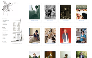
| I don't particularly like this magazine, 'Oh Comely' but I do like aspects of it... I like the idea of using polaroid images, and I like this type. Also aspects of their website are interesting... (see below and http://www.ohcomely.co.uk/) |
 | |
| This is Toast's summer look book that you can flick through online. | I liked the idea of having a compressed version of our magazine that you can flick through online. http://www.toast.co.uk/indexb.htm |
 | |
| This is the online shop for the store Anthropologie. I really like the text used in the different tabs and think it works well with the aesthetic we are going for. The image below is also from their website. http://www.anthropologie.eu/ |
 |
| This website is for a project called The Shop Floor Project- have a look at the website: http://theshopfloorproject.com/. It is really interactive and a real busy mix of images which I think works well with our ideas for the aesthetic of the magazine. It is not your standard website and I love it for that reason. Do have a good navigate through the website. |
 | ||
| On the website they have a blog 'The Shopkeeper's Journal'. I really like the idea of having a blog that is additional to the website and also the idea of it following a character to do with Kentish Town. Alternatively it could just be a blog of 'The Fox'. It could give up to date info about things going on in Kentish Town, think about the blog 'The Kentish Towner' - follow this link: http://kentishtowner.co.uk/ |
Libby


No comments:
Post a Comment